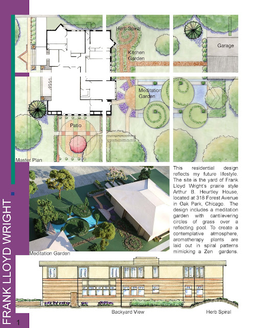
I have made further adjustments to my portfolio from last week. I simplified it by making taking out the dots at the bottom of each page and making the fonts smaller for the supporting text and within several diagrams' legends. Futhermore, the size of the portfolio pages are now 8.5 in x 5.5 in. The pages posted below will appear as 8.5 in x 11 in because of how I printed them. Each page is cut by half horizontally. This new layout allows images to become bigger, with several of the small pages being filled with only one image. It is much cleaner and the images are easier to read this way. Take a look:
Design. 2013.
4.22.2013
4.15.2013
Portfolio Update
I have updated my portfolio and am showing the spreads for my comprehensive project. I have taken out the purple and turquoise bars that were on the sides of the pages. Furthermore, I have included more white space by creating a new grid with larger spaces in between the squares. I also have left some of the squares white throughout the pages. I moved the title to the bottom of the pages. I think it looks much more clean and organized now.
Here it is:
Here it is:
4.08.2013
General Updates
This past week I have been working on final drawings for my comprehensive project presentation that is taking place this Wednesday. I completed two new photomontages to help illustrate my proposed design for the village of Clarksburg, Ohio.
Here are the existing photographs and the proposed photomontages:
Existing conditions. The alley is narrow, and in poor condition. It is not vital for vehicular access.
Proposed design. While the design idea is simple, it has a large impact on such a rural, small community. The alley becomes a pedestrian and bike corridor with a new pavement pattern. In addition I added "traditional" street furniture to increase the comfort for the community residents.
There is a vacant, muddy lot behind the bank. It currently is lacking a sense of place and community.
I am proposing the vacant lot to be filled with a youth-oriented play space. This image illustrates the youth-sized basketball court, a median, and a small piece of the permeable paving parking lot. Additionally, I added street trees, lighting, and benches. I experimented with a fall scene for the first time. It was a bit challenging, because the photograph was taken in the winter and I had to hide bits of snow here and there.
4.01.2013
Plan Enlargement and Section Graphics
This past week I focused on the graphics for my plan enlargement as well as a section. It was only my second attempt for using computer graphics for a plan, and my first attempt for the section.
Take a look:
The gray parts of the enlargement plan are those that are existing. The proposed design is in color. The linework was completed in AutoCAD and then brought into Photoshop. I used various images for textures and plants. I also used a variety of filters to create further textures. The text was inserted in Illustrator.
I created the section in similar ways as the enlargement plan. The linework was created in AutoCAD and brought into Photoshop. I used entourage images for plants, cars and people. I played around with the opacity of objects. Lastly, I inserted the drawing in Illustrator for labeling.
3.25.2013
Master Plan Computer Improvements
Before
After
3.11.2013
Portfolio Spreads
I chose three spreads from my portfolio to display. The layout was inspired by books I have reviewed from Peter Walker as well as Sasaki. I have divided the page into an irregular grid for each page. Furthermore, I wanted my text to fit into the grid, and to be shown through blocks. Here's a look:
2.25.2013
Unit 3.2 Final Update
I have finished all three views of my diorama. I added a backdrop on the side, showing what the greenway would like on the sides. Then for my third view, I showed what the greenway would look like going the opposite direction, about to underpass a bridge. I mentioned the theory behind my diorama in the earlier posts. Take a look at the final product:
View showing the sign.
View towards the bridge.
The original view, which already has acted as a final image.
View showing the sign.
View towards the bridge.
The original view, which already has acted as a final image.
Subscribe to:
Comments (Atom)


